The Best Neutral Paint Colors for Any Home
How to choose paint colors? That is one of the most difficult questions in home decor! Colors can look different in each space under various lighting. If they have undertones, that makes it even harder! To make it easy, I specifically choose paints without significant undertones. Here are some of the best neutral paint colors for inside or outside the home.

Why Choose Neutral Paint Colors
Neutrals are my best decor friends. They are tried and true – you always know where they stand and they place nice with others. This is helpful when dealing with existing features like wood floors, trim, or cabinets. Plus, there are so many design and mental health benefits to neutral decor.
But when I say neutral, I mean an actual neutral. Like it has no funny blue or pink undertones…

So what do mean by neutral paint colors? Without getting all technical, all colors have undertones to them. Some are more warm (with reds and pinks) and some are more cool (with greens and blues). Like me, you may have learned this hard way!
I cannot tell you how many folks have said to me, “Allisa, I painted this wall gray. Really, it was gray on the swatch. But now it’s blluuuuuuue!”(I know this pain all too well after an ill-fated go round with Behr’s Dolphin Gray in 2012).
Color is one of the 7 Interior Design Elements so it’s important to choose wisely!
Neutrals, however, walk the line (cue Johnny Cash) with balanced undertones. Wonderfully, this leaves little room for surprise.
Tried & True Neutral Paint Colors:
Over time, I’ve gathered up a few neutral paint colors to keep in my arsenal. I use them time & time again (looking at you Iron Ore). I keep this list updated with my very favorite neutral paint colors to make it easy to update any space.

Paint Color Samples
Luckily, we live in a world of peel & stick samples to make it easy to select the right paint. Click below to grab any neutral paint samples:
- Iron Ore – Sherwin Williams
- Pure White – Sherwin Williams
- Hale Navy – Benjamin Moore
- Chantilly Lace – Benjamin Moore
- Tricorn Black – Sherwin Williams
- Penthouse– Clare
- Seize the Gray – Clare
- Fresh Kicks – Clare
- Peppercorn – Sherwin Williams
And once you have the samples, be sure to use them correctly! I’ve outlined my favorite tips for Testing Paint Colors to help choose the right color for your space.

Benjamin Moore Chantilly Lace
Chantilly Lace is a neutral white, beautiful in many settings. A very true, pure white. In this home, I painted all of our walls Chantilly Lace. I love how it feels like an artist’s canvas and also contrasts against dark colors and woven shades.

Sherwin Williams Pure White
Pure White is technically a neutral white with the slightest touch of warmth so it’s not harsh but not warm enough to be a cream or pinky white.
I used it on all of our window and floor trim. It’s very similar to Chantilly Lace but just a touch warmer, perfect for framing a space.

Sherwin Williams Iron Ore
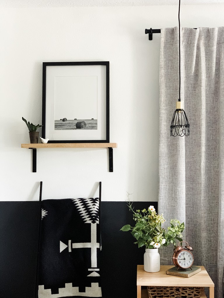
Sherwin Williams Iron Ore is a very dark, neutral charcoal gray with no purple or green undertones. This is one of my all time favorite colors that looks great just about anywhere!
We use used Iron Ore on my Office Accent Wall and the color blocked wall in our main bedroom. This shade is one of the best neutral paint colors and is perfect for a bold accent wall!

Sherwin Willams Tricorn Black
Tricorn Black is rich deep dark black, neutral true black. Not purple or red. When someone says black, this is the color you are imagining!
I’ve used Tricorn on the exterior of my previous home and for my Stone Fireplace Refresh as well as my front doors.
A Few Other Paint Color Favorites:

Behr Black Boudoir
This black paint is one of my newest favorites! Black Boudoir is a very rich, velvety almost neutral black. I love how it creates a very smooth, neutral back drop for artwork and wood. It has a touch of bluish purple undertones to it, making it not quite a neutral – but still very lovely!

Sherwin Williams Dorian Gray
I admit, I’m not the biggest fan of gray paint but I’ve added this beauty to my list of secondary favorites. Dorian Gray is a medium dark, gray with a bit of warmth (that looks way different on the online color cards!).
I just used this to paint my older son’s bedroom (no pics yet!) and I love it for how almost neutral and calm it feels. It definitely has some warm undertones to it so it can look different in a variety of lighting and spaces.
Moving forward, I would consider it as a good accent color, like the front door.
I hope this helps choose neutral paint colors for your home! There’s a lot to understand about paint so breaking it down just a little can make a big difference.
Want to learn more? Check out my thoughts on 2024 Wall Color Trends and How to Add Color to Your Home.


